What Should I Eat?
With the holidays quickly approaching I figured it would be the perfect time to start talking about food and how to make healthy choices. I found this nifty infographic from Precision Nutrition (my nutrition certification) to help me out.
*Please note that the following information is for the average person. If you have certain health conditions that you are being followed for, or are training for something specific, please make sure to ask your health care professional before changing over your diet.*
There are three categories of food:
Green: Eat more/ as much as you want as long as you are hungry.
Yellow: Eat some/ limit how much is consumed.
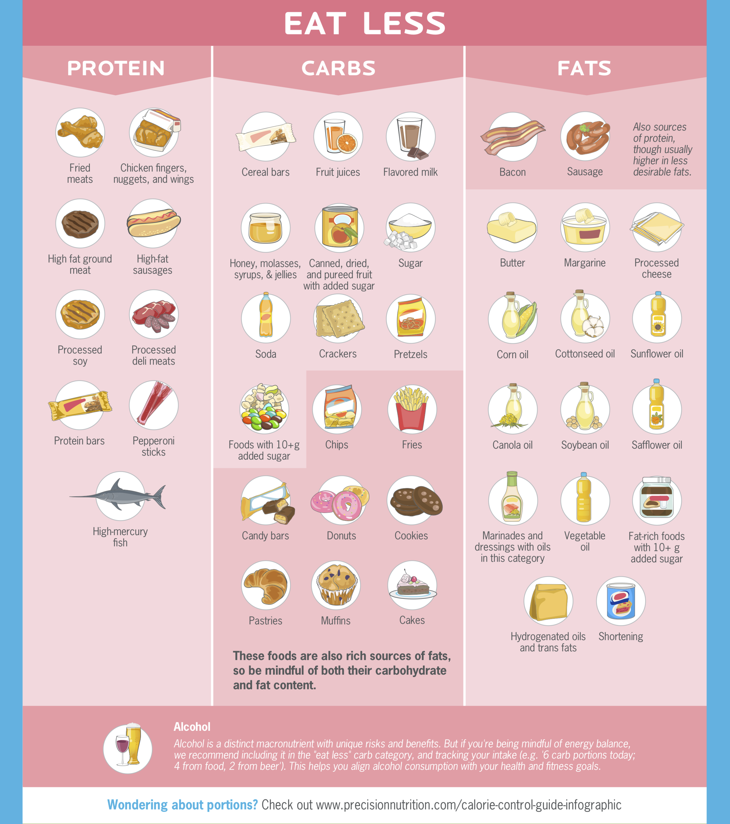
Red: Eat less/ try to avoid as much as possible.
Instructions:
Read and look through the pics on the infographic.
Read my notes below each infographic.
Download AND complete the exercise.
Use what you write in the exercise to help you make healthier food choices.
Starting goal: Incorporate more “green” foods into your diet.
Stay tuned for my next post on portion sizes to help you build healthier, more appropriate meals for your goals. In the meantime, a general guideline is:
Women 1 portion per serving, and men 2 portions per serving.
Proteins = 1 palm
Veggies = 1 fist
Carbs = 1 cupped hand
Fats = 1 thumb
Lentils and beans: These are protein for plant-based eaters, otherwise, they’re considered carbs.
Red meat: High in saturated fat which can cause bad cholesterol (LDL) levels to increase, thus an increased risk of heart disease. It is also harder to digest and stays in your body for longer than other animal byproducts like chicken and fish. Limit quantities to about 4 portions per week (4 palms).
Contrary to the infographic, white bread, white pasta, white rice, breakfast cereal, etc. should be in the red category, not yellow. They are refined/processed carbohydrates that turn into sugar in your body generally causing you to gain weight. They are empty calories (calories with no nutrition) that do not satisfy your hunger for very long - making you crave more in frequency and in volume in order to feel full. Instead aim to eat unrefined carbs packed with lots of nutrition and fiber like fruits, veggies, quinoa, whole or sprouted grain, etc.
Trail mix: Be very careful here. Aim for ones without chocolate, and a minimal amount of dried fruit if any. Nuts are high in fat and carbs, but beneficial ones. When you add in the chocolate and dried fruit, it strays from the "green", becoming less healthy and more on the yellow/red scale.
Alcohol affects the way your body metabolizes and stores carbs and fats. Not only is it empty calories, but when consumed it is used as a primary fuel source for your body. This means that instead of excess glucose and lipids being used from carbs and fats respectively, they are staying in your body and turning into fat - causing you to gain weight.
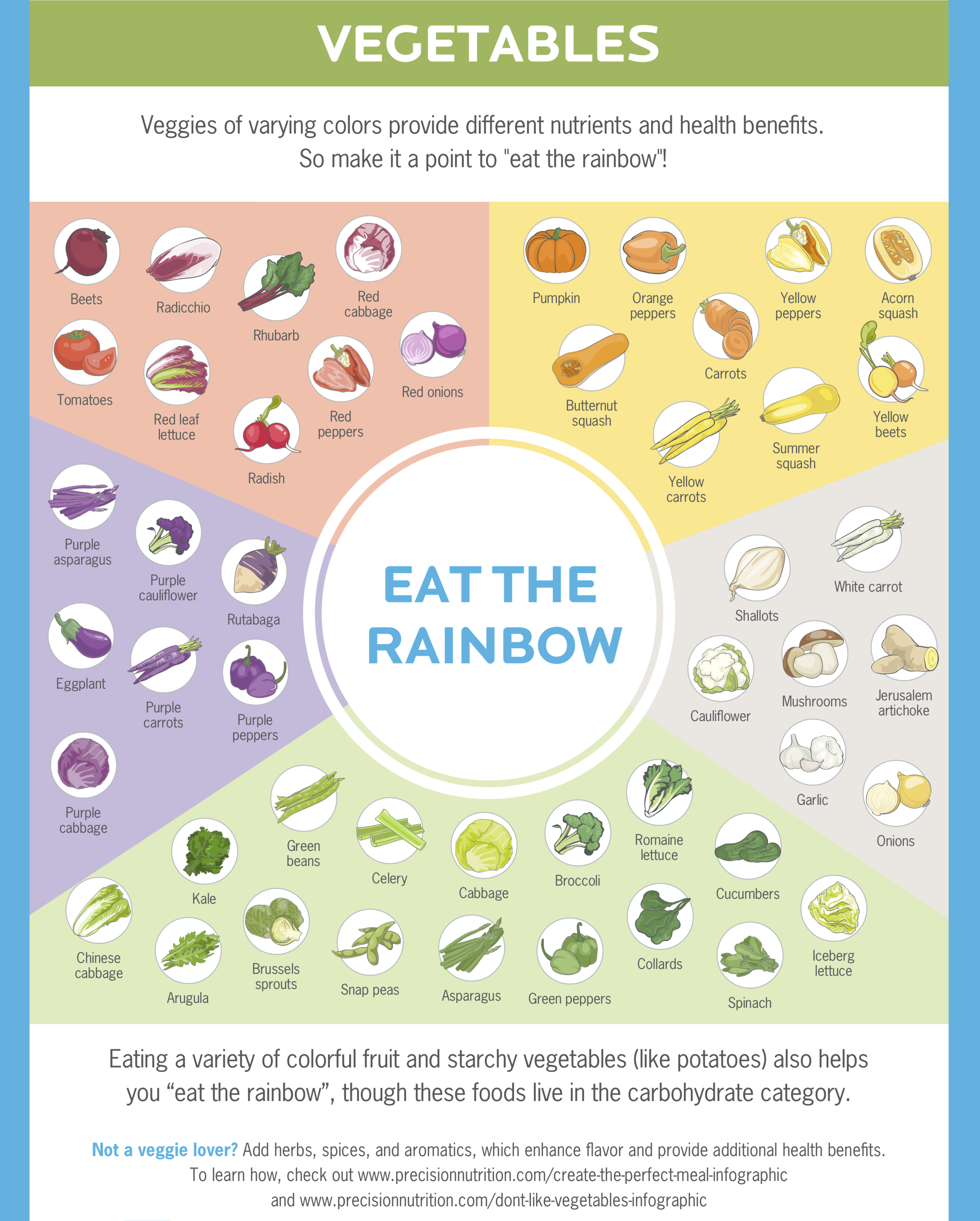
Veggies are "green", and you should have as many as possible in varying colours - but remember that they are still considered carbs, and like anything else, only eat them when you're hungry. Aim to eat veggies at every meal.
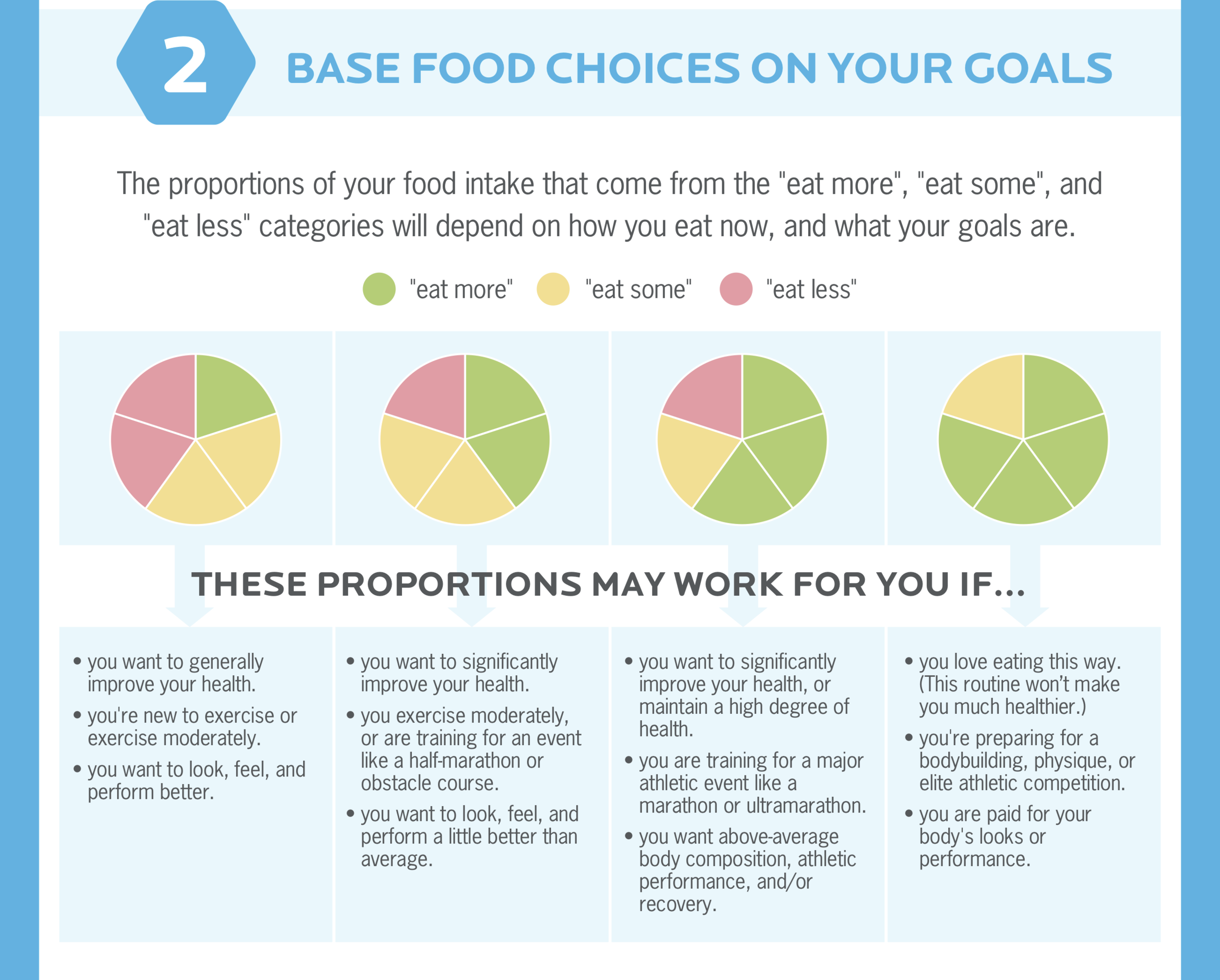
Notes: Your goal (especially if just starting out) is to concentrate on consume more “green” foods. Once you’ve successfully done that, try eliminating some “yellow” and “red” foods. The less “red” foods you consume, the more likely you are to lose weight, gain muscle (if exercising regularly), avoid negative health issues (heart condition, diabetes, digestion problems…), and live a longer, happier, and healthier life.
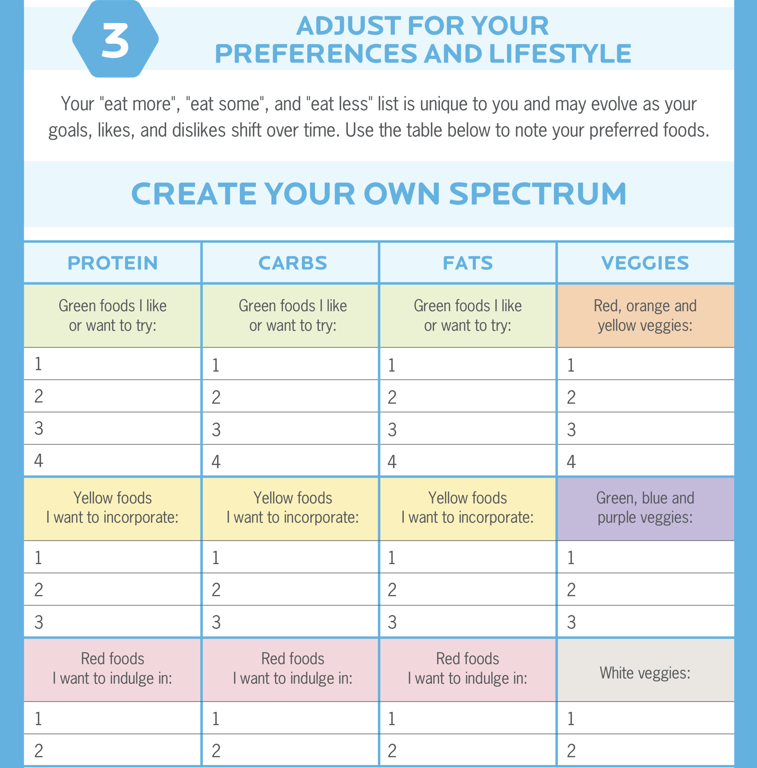
Click here to download this chart. This way you can fill it out and use it to help yourself make healthier choices.


